
 Salud al Limite

A bathroom does not need marble on every wall or a complete renovation to feel luxurious.
Color alone can dramatically change how polished, calm, and expensive a bathroom looks. The right shade can make inexpensive tile feel more intentional, help basic cabinetry look custom, and create the kind of atmosphere usually associated with boutique hotels and designer homes.
The secret is choosing colors with depth and warmth rather than relying only on bright white or trendy shades that may feel dated quickly.
Expensive-looking bathrooms also tend to use a controlled palette. Instead of combining many competing colors, they usually repeat two or three tones across the walls, vanity, tile, towels, hardware, and decorative accessories.
Whether your bathroom is large, small, modern, traditional, or somewhere in between, these seven colors can help create a more elevated appearance.
1. Warm White
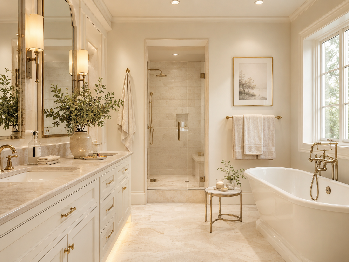
Warm white is one of the safest and most timeless choices for an elegant bathroom.
Unlike stark white, which can sometimes feel cold or clinical, warm whites contain subtle cream, beige, or ivory undertones. These softer tones make the room feel more comfortable while still reflecting plenty of light.
Warm white works beautifully with natural stone, wood vanities, brass hardware, brushed nickel, and black accents.
In a small bathroom, it can also make the room feel brighter and more open without looking plain.
For a sophisticated result, avoid using the exact same shade on every surface. Pair warm white walls with slightly deeper ivory towels, creamy stone tile, and natural wood.
This creates gentle contrast and prevents the room from feeling flat.
If your bathroom receives limited natural light, warm white is especially useful because it can soften shadows and create a more inviting atmosphere.
2. Soft Taupe
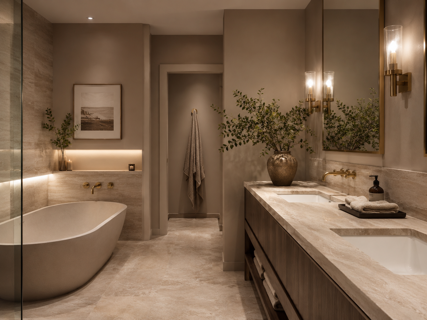
Taupe can make a bathroom feel instantly more sophisticated.
This shade sits somewhere between beige, gray, and brown, giving it enough depth to feel luxurious without making the room too dark.
Soft taupe looks especially beautiful with limestone, travertine, oak, walnut, and brushed brass.
It can also create an elegant backdrop for a white bathtub, white sink, or marble countertop.
For a modern look, use taupe on the walls and combine it with a floating wood vanity and simple black fixtures.
For something more traditional, pair taupe with classic molding, aged brass, and warm white cabinetry.
Because taupe is relatively neutral, it works well in both large bathrooms and smaller powder rooms.
The key is selecting a shade with warm undertones rather than one that appears muddy or overly gray.
3. Deep Olive Green
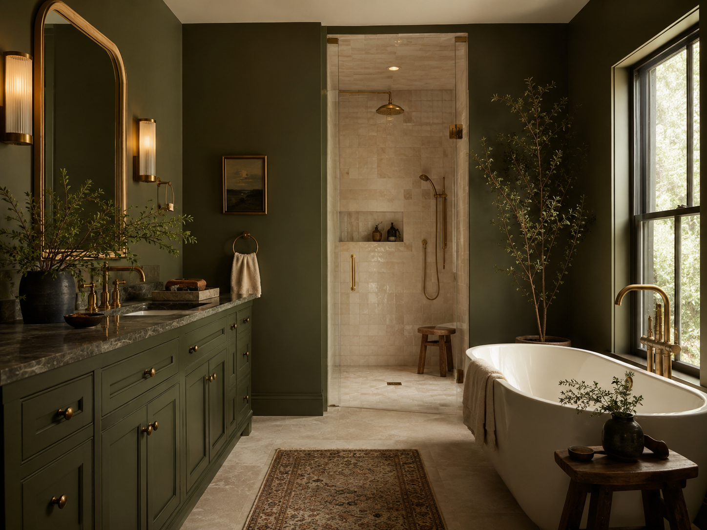
Deep olive green can give a bathroom a rich, designer-inspired appearance.
It feels sophisticated, natural, and slightly dramatic without being as intense as emerald green.
Olive works beautifully with warm wood, aged brass, cream tile, stone, and black accents.
In a powder room, you can use it across all the walls for a more enveloping effect. In a larger bathroom, consider using olive on the vanity, one feature wall, or the lower portion of the walls.
To keep the space balanced, combine deep green with lighter materials.
Creamy tile, warm white towels, and a pale countertop can prevent the room from feeling too dark.
Plants also complement olive beautifully, but avoid filling the bathroom with too much greenery. One healthy plant is usually enough.
This color works particularly well for anyone who wants a bathroom that feels luxurious but still connected to nature.
4. Navy Blue
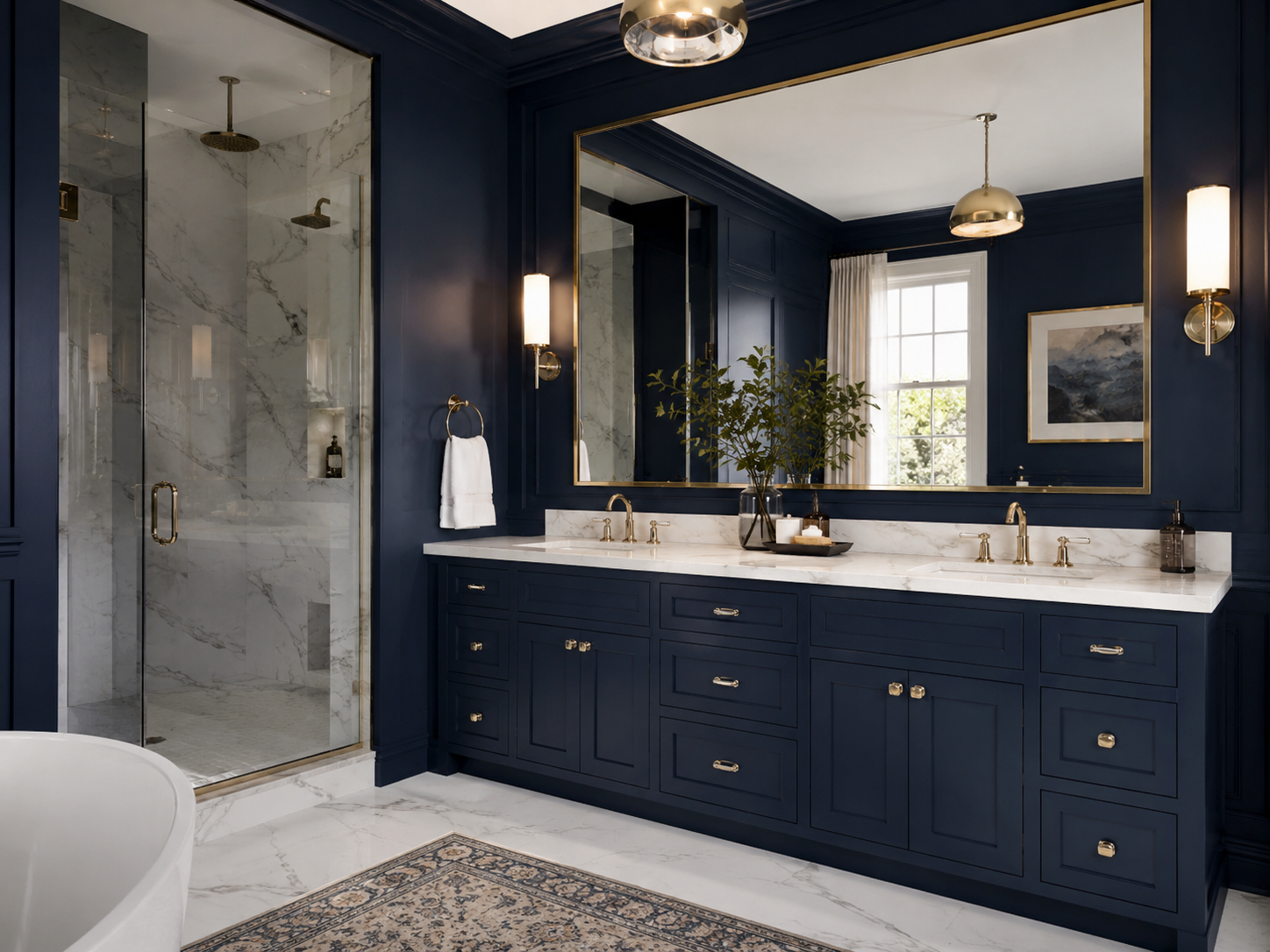
Navy is a classic color that can make a bathroom feel polished and expensive.
It has enough depth to create drama but remains timeless when paired with simple materials.
A navy vanity combined with white stone, brass hardware, and a large mirror can instantly elevate a basic bathroom.
You can also use navy on the walls of a powder room for a more dramatic effect.
For a modern interpretation, combine navy with matte black fixtures and light oak.
For a more traditional look, use polished nickel, marble, and decorative molding.
Because navy absorbs more light than pale colors, good lighting is important.
Layer overhead lighting with sconces near the mirror so the bathroom remains practical as well as attractive.
In a very small bathroom, use navy strategically rather than on every surface if the room already feels dark.
5. Chocolate Brown
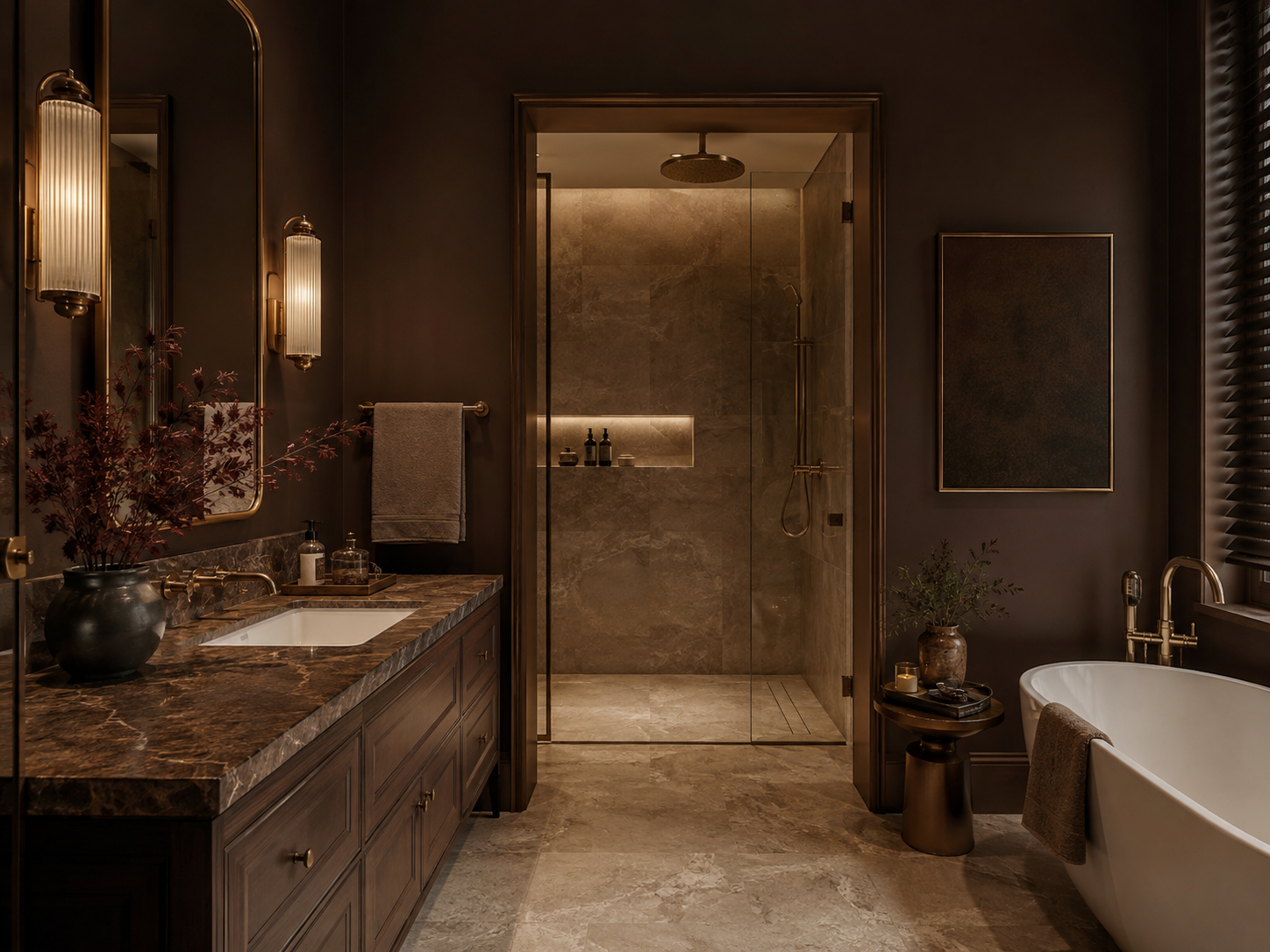
Chocolate brown is becoming an increasingly stylish alternative to black or gray.
Its warmth creates a rich, cocoon-like atmosphere and works especially well in bathrooms with natural materials.
Chocolate brown walls can look beautiful with travertine, warm marble, cream tile, and medium-to-dark wood.
You can also introduce the color through a vanity, cabinetry, or large-format wall tile instead of painting the entire room.
For a luxurious combination, pair chocolate brown with aged brass or bronze.
Cream towels and a light stone countertop will provide contrast and keep the palette from becoming too heavy.
This shade is particularly effective in powder rooms where you can create a darker, more dramatic atmosphere without worrying as much about making the room appear larger.
A few warm light sources can make chocolate brown feel especially elegant in the evening.
6. Charcoal Gray
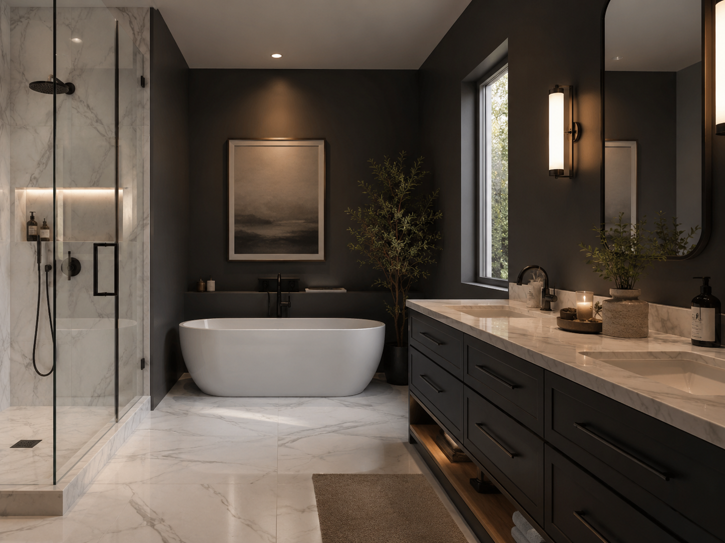
Charcoal can create a sophisticated bathroom when it is used with enough warmth and contrast.
Unlike pale cool gray, which can sometimes feel flat, charcoal gives walls, cabinetry, and tile more depth.
It works particularly well with white marble, black fixtures, brushed nickel, pale wood, and warm lighting.
A charcoal vanity is an easy way to introduce the color without committing to dark walls.
You could also paint the lower portion of the bathroom charcoal and keep the upper walls lighter.
If you want a more dramatic effect, use charcoal throughout a small powder room and add a large mirror to reflect light.
Avoid pairing charcoal with too many other cool gray tones.
Cream, beige, wood, or warm metallic finishes can make the room feel more balanced and expensive.
7. Muted Dusty Blue
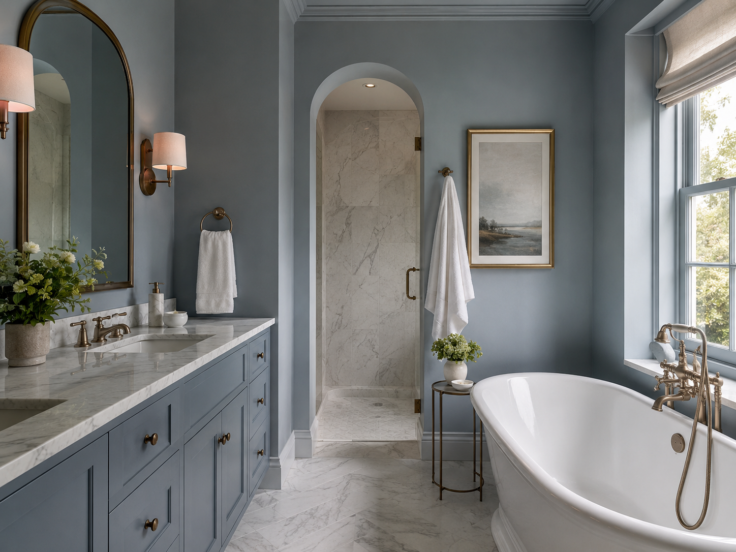
Dusty blue is ideal for creating a bathroom that feels elegant, calm, and slightly softer than navy.
The best versions have gray or green undertones rather than appearing bright or overly pastel.
Muted blue works beautifully with white stone, brushed nickel, light oak, warm brass, and natural textures.
It is especially attractive in bathrooms that receive plenty of natural light.
Use it on the vanity for a subtle statement, or paint the walls for a serene spa-inspired effect.
A dusty blue bathroom can also work well with traditional details such as shaker cabinetry, wall molding, and classic sconces.
For a more modern look, pair the color with a frameless mirror and simple stone surfaces.
Keep the accessories restrained. White or ivory towels, one ceramic vase, and minimal countertop decor are enough to complete the look.
How to Make Bathroom Colors Look More Expensive
The color itself is only part of the design.
The finish, lighting, and surrounding materials also influence whether the bathroom feels luxurious or inexpensive.
Choose paint finishes designed for bathrooms so the walls remain easier to clean and better protected from moisture.
Repeat the main color in small ways throughout the room. For example, if the vanity is olive green, introduce a similar shade through artwork or one decorative accessory rather than adding several unrelated colors.
Use warm, flattering lighting whenever possible. Harsh blue-toned bulbs can make beautiful colors appear cold and uninviting.
Also pay attention to hardware.
Matching or intentionally coordinated faucets, cabinet pulls, towel bars, and light fixtures can make even a simple bathroom feel more polished.
Best Color Combinations for an Expensive-Looking Bathroom
Warm white looks beautiful with natural oak, beige stone, and brass.
Taupe pairs well with walnut, ivory, black, and travertine.
Olive green works especially well with cream, warm wood, and aged brass.
Navy feels classic with white marble, polished nickel, or brass.
Chocolate brown looks rich beside cream stone, bronze, and natural wood.
Charcoal works beautifully with white, light oak, and brushed metal.
Dusty blue combines easily with ivory, pale wood, and soft metallic finishes.
The most important rule is to avoid using too many colors at once.
A simple palette usually looks more intentional.
Bathroom Color Mistakes to Avoid
Do not choose a paint color based only on how it looks online or on a small sample card.
Bathroom lighting can significantly change a shade. Test the color on the actual wall and observe it during the morning, afternoon, and evening.
Avoid bright white when every other material in the room has warm undertones. The contrast can make the surfaces appear disconnected.
Do not combine several unrelated statement colors.
One strong shade supported by quieter neutrals will usually create a more sophisticated result.
Also consider the existing tile, countertop, vanity, and flooring before painting. A beautiful color can still look wrong if its undertones clash with the permanent materials.
Finally, avoid overdecorating once the color is in place.
Luxury bathrooms often feel calm because they contain fewer, better-chosen accessories.
How to Choose the Right Bathroom Color
Begin with the materials that cannot easily be changed.
Look at the tile, countertop, flooring, bathtub, and vanity. Identify whether their undertones feel warm, cool, or neutral.
Next, consider the amount of natural light.
Bright bathrooms can support deeper colors, while rooms with very little daylight may benefit from warm whites, taupes, or lighter muted shades.
Think about the atmosphere you want to create.
Warm white and taupe feel calm and timeless. Olive and dusty blue feel natural and relaxing. Navy, chocolate brown, and charcoal create more drama.
The best color is one that complements the existing room rather than fighting against it.
Final Thoughts
The right bathroom color can make a surprisingly large difference in how expensive and polished the space feels.
Warm white, soft taupe, deep olive green, navy blue, chocolate brown, charcoal gray, and muted dusty blue all offer elegant alternatives to basic bathroom colors.
You do not need to remodel the entire room to use them.
Painting the vanity, updating one wall, changing the accessories, or introducing a stronger color through cabinetry can completely refresh the space.
Keep the overall palette simple, coordinate the hardware, improve the lighting, and allow the color to become part of a cohesive design.
With the right combination of shade, materials, and styling, even a simple bathroom can feel much more luxurious.


